Time Tink
Quick time logging anywhere
Team
Duration
Role
Project type
Client
3 people
2.5 weeks
UX designer
Academy
Time Tink
Impact
The proposed redesign achieved measurable improvements:
Reduced the number of clicks and steps required for completing tasks.
Introduced comprehensive dashboard data for faster review by supervisors.
Provided a structured foundation for future usability testing and iteration.
Mission
Time Tink is a time tracking web application designed for students to log work placement hours and connect with supervisors, while enabling institutions to oversee progress. As a start-up, the client needed to improve time logging efficiency and better understand students’ needs. The project aimed to streamline key workflows—such as time entry, onboarding, and progress review—so students could complete tasks with fewer steps, while supervisors could quickly access accurate, consolidated data.
My Contributions
As the UX designer, I led the evaluation and early redesign process to identify usability issues and opportunities for improvement. My contributions included:
Conducting a heuristic analysis based on best-practice design principles to uncover usability issues.
Mapping out the existing workflows and documenting pain points.
Running user testing to validate issues and gather insights on student needs and motivations.
Designing new wireframes (mobile and desktop) for sign-up, dashboard, and onboarding screens.
Recommending improvements that reduced unnecessary clicks, introduced error prevention, and clarified
The Process
Step 1 – Heuristic Analysis & Flow Audit
The project began with a heuristic evaluation of the platform’s current flows and interface. The analysis highlighted multiple friction points:
No clear guidance for program setup.
Missing error notifications to guide users through task completion.
Inability to edit or delete draft time entries, leading to redundant records.
This audit provided an evidence-based starting point for redesign priorities and helped shape the user testing plan
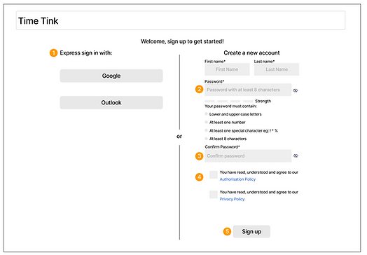
Sign-up process:

-
QR code for downloading mobile access appeared in the middle of the signup process.
-
Users were confused with the QR code; they assumed it was mandatory.
-
Users did not notice the “log in here” link for the desktop onboarding option.
-
Users expected to see the home page instead of the QR code.
Dashboard:

-
The live tracking button dominates the page, and users press it without knowing the function.
-
Many users expected to see placement progression under "you activity" data.
-
Participants had trouble finding time entry history.
Onboarding:

-
Lack of instruction about where and how to add supervisors.
-
Some users were looking for email or chat functions to get in touch with supervisors.
-
Users had to invite the supervisor to the organisation page, the assignment on the project page and the time entry page, which is repetitive and confusing.
Step 2 – User Testing & Insights
Next, I ran usability testing sessions with students to validate the heuristic findings and uncover deeper needs. Key findings included:
-
Dashboard lacked information hierarchy, making it hard to scan for important updates.
-
Sign-up process did not offer clear error prevention responses, leading to repeated mistakes.
-
Onboarding lacked step-by-step instructions, leaving users uncertain about where to begin.
-
Students also expressed the need for more control over their entries and clearer progress tracking.

Step 3 – Proposed Low-Fi Wireframes
With validated insights, I proposed responsive wireframes for the sign-up page, dashboard, and onboarding flow. The redesign focused on:
-
Streamlined task flows with fewer clicks.
-
Improved information hierarchy in the dashboard for faster scanning.
-
Clear error prevention and feedback messaging in sign-up forms.
-
Step-by-step onboarding guidance to help students start quickly and confidently.
-
These wireframes served as the foundation for further iteration and alignment with the client’s development team.
-
If you’d like, I can also make a visual slide-ready portfolio version of this that mirrors the Payment Process Redesign example you shared, with icons and concise bullet points for each step. That would make it ready to drop into your portfolio presentation.
Sign-up page

Onboarding

Responsive mobile screens


